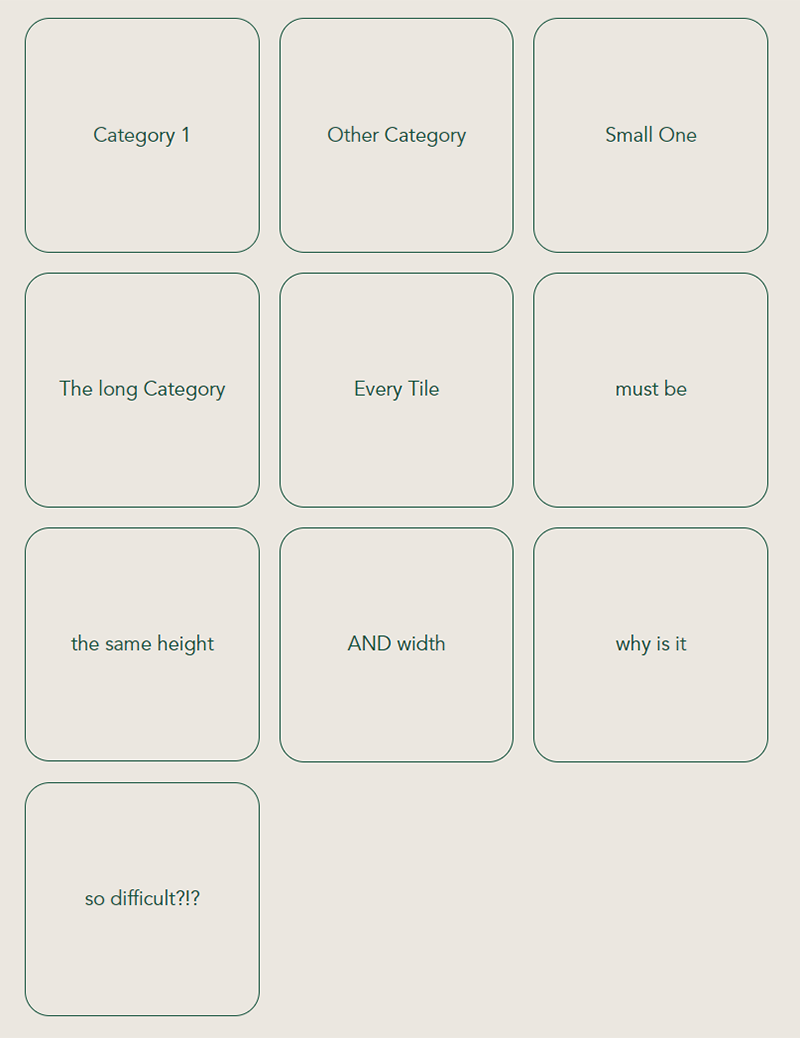
It sounds so incedibly simple: you just want a layout with a (variable) number of boxes like the tiles in your bathroom, but without the mortar:

This requirement comes in regularly if you have to show categories in a nice and easy tile design, right? Right. But it’s really really difficult to make even if it sounds so incredibly easy. So don’t feel bad like I did for years, if you battle with this.
I somehow always found a hack or 2nd best soluting to make it look almost right, but every simple solution has its problems when its gets to wrapping and showing equally sized tiles in every row.
So this guide will give you a short, comprehensible and perfect solution for square tile lists with css grid and flex.
Let’s start with putting down how exactly we expect out layout to be:
- equal width and height of every box (like, well, a tile)
- boxes have to stretch out to fill the whole width of the page (no nasty margins around it)
- but at the same time they should wrap so we fill the space nice and evenly
- And, yes: we need the content of the boxes to be centered not only horizontally but also vertically
- the css flex neck breaker: you want the last item to be the same size as the boxes above and *not* take up the whole width

