It sounds so incedibly simple: you just want a layout with a (variable) number of boxes like the tiles in your bathroom, but without the mortar:
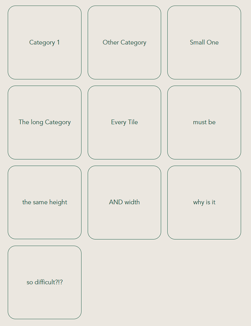
This requirement comes in regularly if you have to show categories in a nice and easy tile design, right? Right. But it’s really really difficult to make even if it sounds so incredibly easy. So don’t feel bad like I did for years, if you battle with this.
I somehow always found a hack or 2nd best soluting to make it look almost right, but every simple solution has its problems when its gets to wrapping and showing equally sized tiles in every row.
So this guide will give you a short, comprehensible and perfect solution for square tile lists with css grid and flex.
Let’s start with putting down how exactly we expect out layout to be:
- equal width and height of every box (like, well, a tile)
- boxes have to stretch out to fill the whole width of the page (no nasty margins around it)
- but at the same time they should wrap so we fill the space nice and evenly
- And, yes: we need the content of the boxes to be centered not only horizontally but also vertically
- the css flex neck breaker: you want the last item to be the same size as the boxes above and *not* take up the whole width
Solution with a combined css grid and flex approach
To solve this puzzle you need both, grid and flex. Thats the bad new. The good is: you need only small bits of both and they are easy if you know them.
First let go of the idea, that css flex is the easy way out. If you are like me you fumbled around with it a lot and made some hacks like adding empty hidden boxes to fill up the last line and keep the solitary last item from growing and taking up the whole fricking space of the last line.
This works if you have a static width of the design, but nowadays you want it to look good on a smartphone and also on a tablet. So there just is no easy way out and those hacks only work in a narrow scope. After all when it comes down to evenly size elements it’s just not what css flex was meant for.
At the same time css grid sounds very static and not flexible enough to wrap the columns if needed, but that is also a misconception because it can wrap with just the right code. No trickeries needed.
First of all lets code the parent element. I call it .squareGrid and is has only three lines:
.squareGrid {
     display: grid;
     grid-template-columns: repeat(auto-fill, minmax(150px, 1fr));
     grid-gap: 1em;
 }
The main attribute is the grid-template-colums. This is very versatile and powerful if you can take full advantage of its abalities.
The auto-fill attribute allows the grid to line up as many grid tracks (columns or rows) as possible without overflowing the container. This can create similar behavior to flex layout’s flex-wrap: wrap.
The minmax() function allows you to set a minimum and maximum size range for a grid track. In the code above, the width of column tracks will be a minimum of 150px and maximum of whatever free space is available. This makes every column the same width, regardles of how many items there are in one row.
The grid-gap makes the spacing between the boxes and you don’t have to worry about margins taking up space making everything wider than expected or shrinking the content in the box because it also goes around the boxes. This really does what is says and puts the gap only between the tiles.
And here the code for the child-elements, our tiles – also very short and easy:
 .squareGrid div {
    display: flex;
    align-items: center;
    justify-content: center;
    aspect-ratio: 1 / 1;
}
Oh, here is the flex again. But why?
The display: flex has little to do with the layout of the boxes but in this case only takes care of the content of the box. As we want the text to be centered horizontally and vertically we use the handy but not very intuitive:
- align-items: center (cares for the otherwise very hard to achieve vertical alignment in the middle)
- justify-content: makes the text center on the horizontal axis
And finally the neat aspect-ratio! A proper tile is always rectangular, right? And so are our boxes if we just tell them, that our aspect-ratio shall be 1/1. Now that was simple.
Conclusion: no more worries with tiles in css if you know how to put grid and flex together as a team.